

Every retailer eventually has to answer two questions: Does this brand know what it is, and does the physical space reflect it? Brand identity changes by retail category, price point, and customer, but the need for clarity is constant. The retailers who know exactly who they are build environments that effortlessly communicate their identity; they don’t leave it to the customer to work it out for herself. Identity clarity makes every decision easier; it does not require the biggest budget or high drama to get right.
Why does brand identity matter? And the answer is: If retailers don’t have brand clarity, customers will create their own identity of your brand.
Identity at Risk
Brand identity should be self-explanatory. Identity shows up holistically in the product mix, signage, the way associates engage, and the sequence in which the brand story unfolds. The risk is that if a brand does not clearly understand and articulate its identity, customers will do it for them. The brand then loses its agency and the soul of its purpose. Identity is both a strategic and design question. A mission statement provides the brand purpose that informs the store design. The language is precise but is not easily visualized. The store design has to interpret a concept through fixtures, material choice, and décor. When all elements are aligned, every square foot reinforces that identity.
What separates a well-designed store format that can scale from one that misses the point and stalls? The answer is clarity of identity. Budget, square footage, and lighting alone do not create a harmonious brand statement. It takes intent to translate an identity statement into a physical space. All too often, a store interior contradicts the brand’s identity. A recent visit to Old Navy opened with a front-of-store that got it right: red, white, and blue for summer, July Fourth, and the World Cup. Shorts, tanks, sweatpants, and soccer kits for the whole family were all under one confident point of view. That clarity helped the brand earn $2.0 billion in net sales and one percent comp growth last quarter in denim, active, kids, and baby. The design cohesion did not survive the walk to the back of the store. Density increased with every step deeper into the store until one shop could no longer be distinguished from the next; fixtures repeated with little variation, and the checkout queue became a catchall for candy, snacks, and beauty rather than a stage for a final impression.
Gap’s launch of the Hailey Jean collab in-store failed from a different perspective. The launch windows were confident; Hailey Bieber styled in the low-slung denim she is actually known for. Her aesthetic is so consistent that it barely needs a headline. Three days later, the store design discipline had eroded into confusion. Inventory had thinned considerably; mannequins stood stripped or hastily redressed, and nothing on the floor suggested a plan for what should happen once the capsule sold through. The launch proved the concept worked but the format couldn’t sustain its own success. Granted, these were random store visits, but they show that clarity is not a single event; it requires daily maintenance.
The C-suite is starting to notice. RH promoted longtime chief people officer Sandy Pilon to its newly formed chief customer experience and values officer role, where she will lead gallery, hospitality, interior design, delight, people, optimization and other teams. Pilon’s move is tied directly to brand consistency and clarity that reflects RH’s values. She said that every experiencial interaction builds what she calls “lasting relationships with teams and customers around the world.”
Clear Cases
I visited several retailers this summer that get identity clarity right. They are smaller retailers, and by comparison, some of the most heavily invested store formats I visited left me guessing. Clarity improves the experience because it removes any friction the customer consciously notices. Clarity defines space and place, creating an environment to help keep customers from feeling lost or unsure. Clarity makes shoppers more willing to stay. It also builds connection: The customer trusts what she can understand and feel. Identity doesn’t require spectacle; it requires alignment before a single fixture goes up. I’m sharing three retail formats that make the case for clear brand identity, each for a different reason.
· Sea Bags: Sourcing by Design
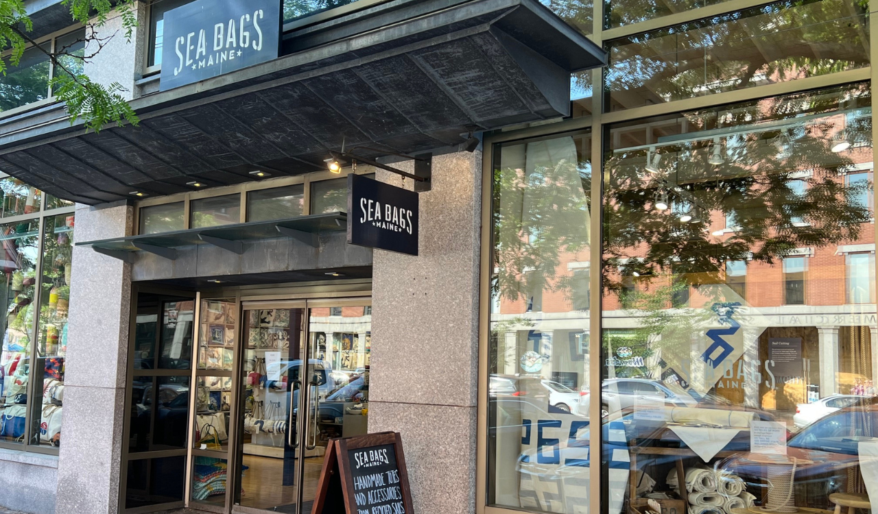
An A-frame chalkboard outside a Portland, Maine shop reads: “Handmade Totes and Accessories from Recycled Sails.” Seven words. The entire brand is expressed before a customer opens the door. Sea Bags has reclaimed sails since 1999; eight to ten thousand annually, with more than four million square feet of sailcloth repurposed since its founding. Those highly visual numbers are not buried on a website. They appear on signage cards placed wherever the customer is closest to the product. The Vintage wall carries the idea further: Dozens of bags are made from sailcloth cuts, each carrying the original markings, numbers, or graphics. No two bags are the same. The product is the display; the display is the story; and the store design is an exercise in nautical aesthetic that transcends trends.
Sea Bags now operates more than 40 retail locations. The concept has scaled without its identity drifting. The sourcing story is not a marketing layer applied onto the brand; it is the format itself. The identity taps into imagination, wanderlust, and the pure joy of sailing. When a brand’s origin story is strong enough to become the store design itself, over investment in fixtures doesn’t contribute additional meaning.
· Faherty: Intentionally Iconoclastic
Faherty is a family-owned B-Corp clothing brand founded in 2013 by twin brothers Mike and Alex Faherty. Its brand has a surf, relaxed vibe. Translating that ethos into a store design is pulled off by using fixtures that look vintage rather than ordered from a catalog. Without looking pretentious, driftwood is repurposed to display baseball caps. Design props, light fixtures, and plenty of wood reinforce a casual lifestyle feeling. The intention is sustainable American heritage style.
Deliberate, casual design is nuanced. A slightly imperfect, mismatched design often feels safer than a cold, perfect, impersonal space. Comfort is created through the recognition that a store’s personality can be more like real life rather than a stage set that looks fake. Faherty proves that point with 80 stores, each with a personality that protects the brand identity. Brand clarity does not require visual uniformity. It requires a narrative discipline and a story cohesive enough to hold together across design elements that were never meant to match.
Anthropologie: Similar but Different
Anthropologie has captured a boho-chic spirit that is welcoming and irresistible for its loyal customers. No matter the season, it never breaks character. You always know when you’re in an Anthropologie store even though each of the 250-plus stores is unique. That’s its charm and intentional brand identity. The visual themes, walls, fixtures, and styling read as one holistic argument rather than a set of individual choices made by different people at different times. That connective discipline is what most specialty retail is missing.
That discipline shows up in specific, repeatable choices, not a single signature move. Each shop within the store is distinct, so a customer knows where one concept ends and the next begins even before she looks at a single piece of product. Product is hung and draped to showcase construction and details rather than simply hung to fit a rail. The displays guide the eye through the space the way a stylist would guide a client, rather than how a warehouse organizes stock. Materials, polished silver next to wrought iron, reclaimed wood next to marble, are deliberately eclectic; nothing feels mass-produced, although nothing feels random. What distinguishes Anthropologie is that every store shares the same identity, rather than functioning as an isolated island created by different teams with different mandates.
One Constant
What is the throughline of these three different formats: a sourcing-driven brand that scales to more than 40 locations without a story drift; a specialty apparel brand that builds identity through fixtures that don’t match; and a retailer that emulates a single theme in 250-plus stores worldwide, each similar but different. Budget, square footage, and category complexity vary across all three. What makes each one work is not the physical design variables; it is visual identity clarity that aligns with each brand purpose.
Identity clarity answers the question a customer asks within the first five minutes of a visit: What does this place stand for, what does it believe in, and is its visual identity authentic? The retailers who treat identity clarity as a starting point, not an afterthought, are the ones whose stores succeed as brand extensions, not containers.