
Young people haven’t heeded the invitation to “fall into the Gap” for years now, but that’s starting to change. The numbers are trending the right way: Gap’s net income is $274 million to date in 2024 compared to $218 million last year and earnings per share jumped by 24.1 percent. The company’s gross margin increased by 140 basis points, a 42.7 percent improvement over last year’s figure.
The thing that many retailers fail to understand about reaching next gen consumers is, as much as each young consumer strives to individuate, they want brands to show up as their true selves too. Pivots like Abercrombie’s appalling push towards adult millennial workwear and Gap’s even more macabre Kanye collaboration (which was so atrocious it merits punishment) feel anything but authentic to the brands.
Things were looking rough for Gap brands for a while there. Serial CEOs with limited retail experience were business as usual, with most of them driving Gap to its own race to the bottom, Then the ill-fated collaboration with Ye and heavy “positioning drift” in 2020 took Gap a bold step down a widening gyre to more loss. The continuous logo revamps and monotone offerings didn’t do the brand any favors either.
So, how did Gap manage to start turning the ship around and, more importantly, how did Gap do it in this tumultuous economic landscape? Let’s break down some of Gap’s most genius (and cringe-worthy) moves that motivated the legacy retailer to turn the beat around.
“Operational Discipline” Making Headway Under New CEO
Gap is the perfect example of how back-of-house logistics can help a brand remain competitive. Gap CEO Richard Dickson is the man who brought on Barbie’s resurrection at Mattel. He took the Gap reins in August 2023 and quickly showed the world that he was ready to make big changes. While leadership at Gap hasn’t stuck since Mickey Drexler made the company a behemoth, Dickson’s first year at the helm has proved promising. But he’s not just playing happier music in stores and revamping Gap’s marketing strategy. Many of his core efforts include supply chain restructuring.
Gap’s third quarter, ending Nov 2, 2024, saw a 9.3 percent operating margin, the highest in seven years. A leaner inventory strategy (at 16 percent of last year’s stock) paired with a more compelling, nostalgia-based apparel selection set Gap apart in the oversaturated landscape.
Lower commodity and air freight costs helped drive the company’s recovery, but continuous brand reinvention is the key that might make it last. On top of this, Gap is focused on revising its global supply chain strategy to adapt to the evolving shipping landscape. In thinking ahead and preparing to pivot before national shifts, Gap will be well-positioned to offer competitive shipping options in the years to come.
Lessons from Gap’s Logo Experiments
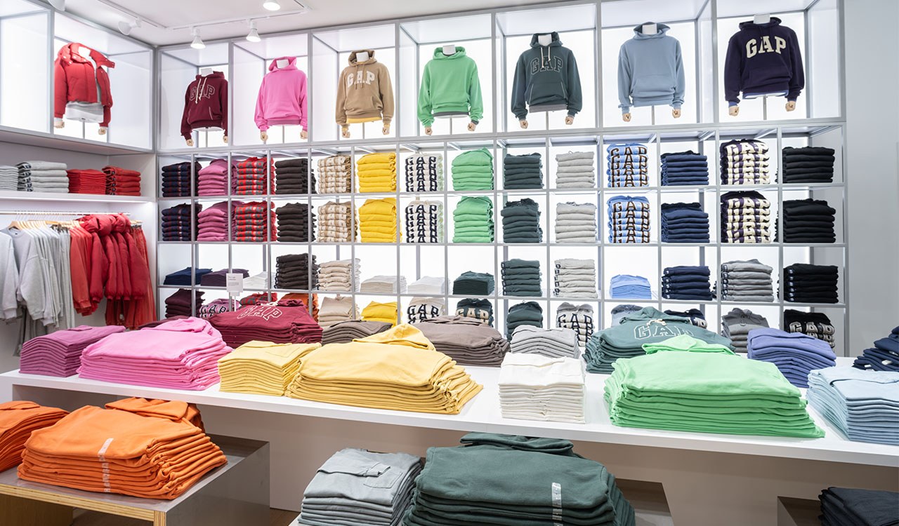
Gap’s reinvention is also a story of optics. The company’s famous blue square logo with white font––which ran from 1986 onwards––was abandoned in 2010 in favor of a block letter version more in line with the company’s earliest black, lowercase lettering logo iterations, which ran from 1969 to 1986.
While customers definitely love vintage, Gap’s core customer base didn’t remember the original logo and the revamped logo that ran from 2010 to 2016 wasn’t vintage enough to bring to mind the 60s and 70s logo. And it’s not modern or cool enough to attract the Gen Z demographic. Gen Z , I can’t belabor enough, is highly nostalgic about their 90’s toddlerhoods. To briefly deconstruct the graphic history, Gap kept the famous blue square of their most famous logo but muted it, shrank it, and stuffed it behind the lettering. They capitalized the “G’ in “Gap” and made the lettering uber-bold––some would even say aggressive.
While this was partly in response to refresh the brand and address declining sales, nobody can fault the legacy brand for trying something new. But it only served to further alienate nostalgia-based customers who decried the pivots away from Gap’s core brand identity. The logo became emblematic of a company that had lost its way. So, in 2016 Gap got back to the basics, bringing back the blue box logo with white font, but even that didn’t save them from the ill-fated “Ye”/garbage bag collab.
And looking forward, Gap’s creative prospects are looking up. The company’s new design director, Zac Posen, was appointed to the role in February 2024. Posen brings expertise from his apparel lines at Target and Saks Fifth Avenue, as well as a devoted fanbase from his stint at Project Runway. He now collaborates with Dickson as Gap’s “cultural curator and creative partner,” bringing desperately needed trend forwardness and relevancy to the legacy retailer.
Nostalgia Speaks to Those Who Never Lived It
The thing that many retailers fail to understand about reaching next gen consumers is, as much as each young consumer strives to individuate, they want brands to show up as their true selves too. Pivots like Abercrombie’s appalling push towards adult millennial workwear and Gap’s even more macabre Kanye collaboration (which was so atrocious it merits punishment) feel anything but authentic to the brands.
Retailers need to understand that Gen Z grew up looking at photos on their phones and online from the early aughts. Photos of celebrities donning old school Gap branded sweatshirts (millennials beware, they’re calling them “vintage” now) and Von Dutch caps informed this look backward. Why do you think all the exposés on legacy brands have become so popular? They’re the place where millennials unpack their brand trauma and Gen Z listens, judges it, and elevates the cry for inclusivity.
Inclusion Isn’t Optional
Gap is reproducing “vintage” fashions and using its early aughts logo for those who’ve never seen it in the present tense. The legacy brand is also “bridging the inclusion gap,” As seen on the company’s D&I page: “… standing up for LGBTQ+ rights decades before the world woke up to it. Or insisting on color palettes that work for the true breadth of skin tones, and on size positivity that celebrates more human dimensions. And working to ensure the people who make our clothes are empowered to raise their voice and be included in conversations about their positions, their conditions, and their careers.”
Gap publicly publishes an annual ESG report including gender, racial, and ethnic inclusion data (transparency, anyone?). The company formed its first Equality & Belonging Group in 1999 and continues to invest in amplifying voices from historically marginalized communities. And it provides training on hiring and leadership inclusivity for all managers. Gap is walking the walk and doing so publicly and loudly enough that no next gen prospective consumer can ignore it.
A New Generation Falls into the Gap
Gap’s latest and most successful reinvention serves as evidence that legacy retailers must toe the line between inclusive reinvention, strategic sourcing, and calling upon the right types of nostalgia to reel in next gens. Sure, Gap took quite a few missteps along the path to reinvention. But Gap’s evolution has come full circle to bring the brand back to the easily recognizable heart-tug classics that made the brand a success in the first place. And that is the yellow brick road to renewed success.